Chit Chats
What if you could ship without borders?
Background
How do you reduce shipping costs for Canadian sellers and level the playing field against American sellers?
Chit Chats is a Canadian online shipping platform delivering packages across the border, with the mission to help Canadian small businesses ship affordably and competitively to US customers. Clients purchase discounted postage from Chit Chats up to 70% cheaper than Canada Post.
When Venture Media acquired Chit Chats, I was able to jump on the project with a running head start. The year prior, I spent time learning about shipping logistics through a bootstrap business we’d started with the goal of easing the cost of shipping. Once we identified the great opportunity to solve the shipping problem for Canadian sellers, the merger and acquisition of Chit Chats made sense to accelerate growth.
As a Senior Product Designer, I focused on creating a new brand identity to position Chit Chats as the leading low-cost carrier in Canada, removing labour-intensive processes and designing user-centric, efficient workflows.
Roles
Art Direction
UX
Brand Identity
Studio
Venture Media
Year
2017-2019
Embracing a client centric voice and website
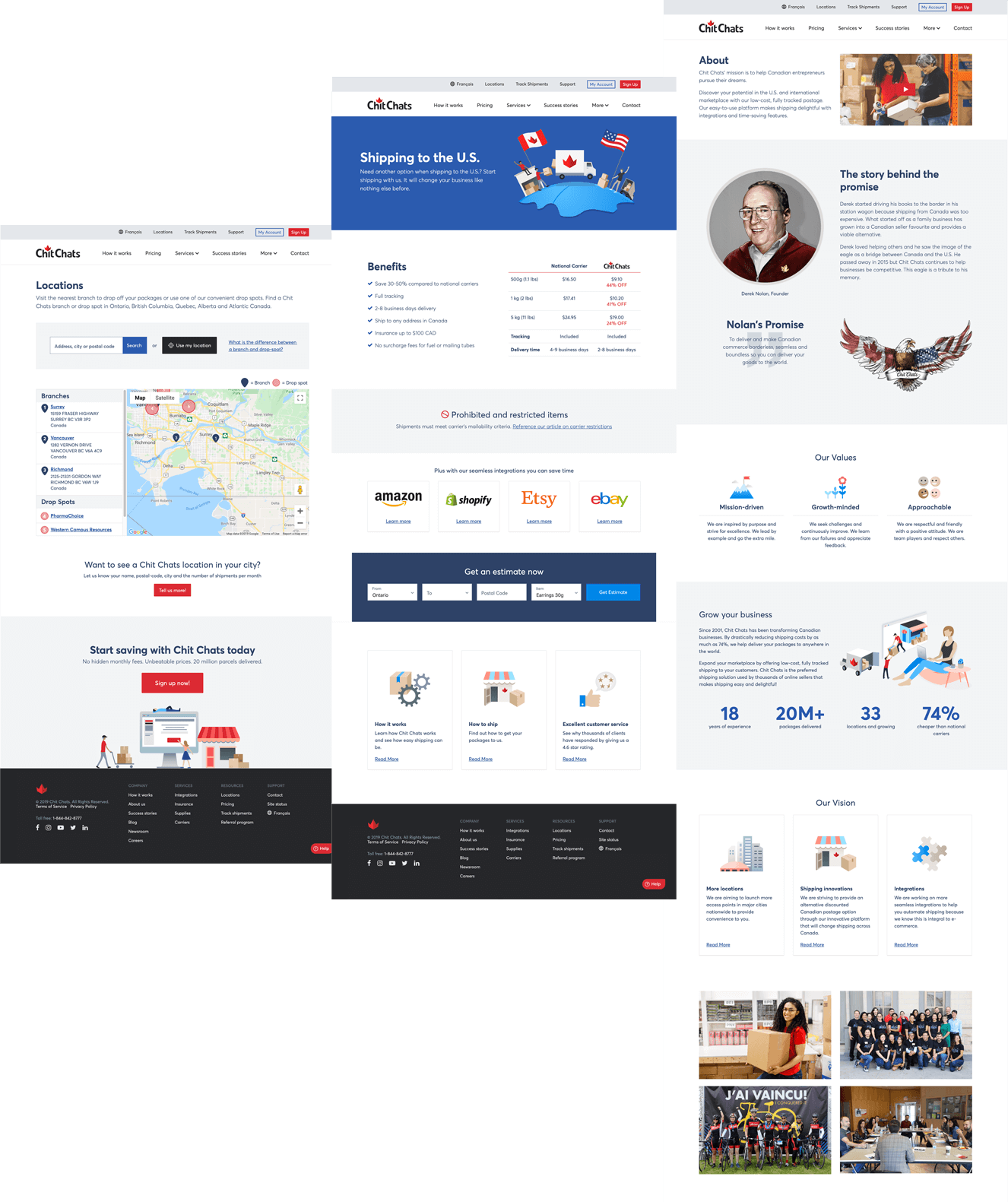
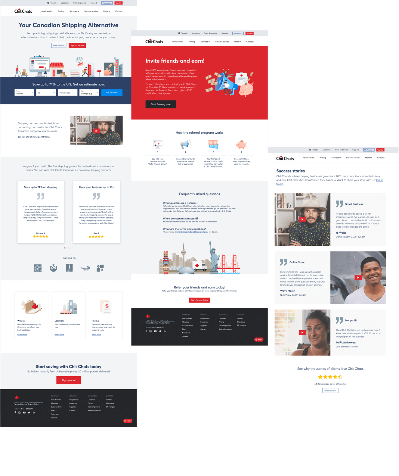
Based on customer research and content strategy, we pivoted the product-centric brand to a customer-centric one. I redesigned the website from the ground up. In order to keep the website consistent and cohesive I designed and built an evergreen style guide that allowed designers and developers to have a common reference to use while creating new interfaces.
Mobile inclusive
The navigational structure alters between mobile, tablet, and desktop, ensuring the user is served based on device type and behaviour.


Goodbye, Google Sheets
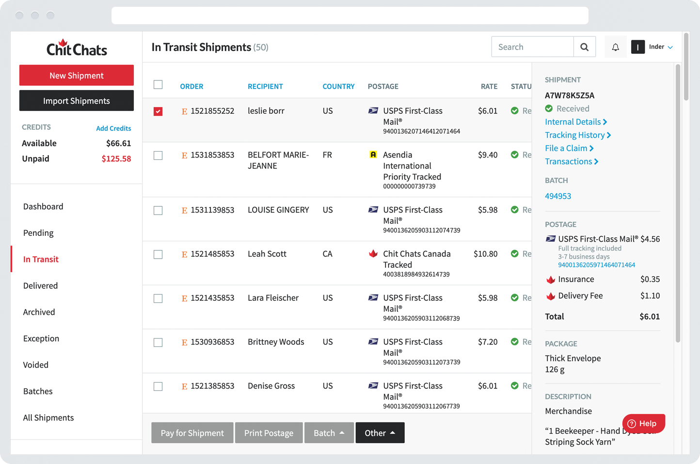
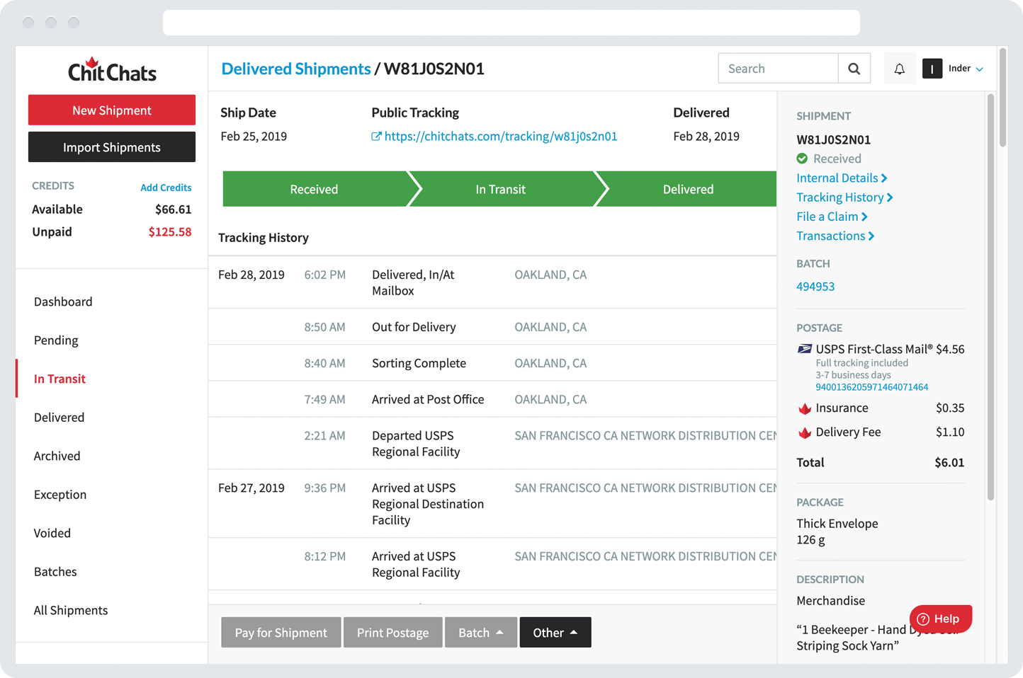
Going from Google Sheets to a self-serving dashboard was a fundamental shift. Clients now had the ability to view all shipments in an organized way. One of the primary goals of the dashboard was to surface information at a glance, minimizing scrolling. This funnelled attention and prioritization to core information.
Brand identity
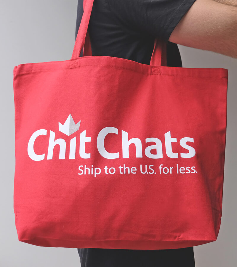
Chit Chats originally used a logo that was heavily inspired by the American flag. Now being proudly Canadian owned and operated, I wanted to create a logo mark that hinted at the company’s Canadian roots. Following the brand strategy and completing about 25 variations I came up with the pseudo, downward pointing logo mark that held the entire logo together.
While many industry competitors use muted colours and complex graphics, Chit Chats’ simple, straightforward design utilizes a bright palette and bold logo mark, achieving a distinct and powerful impression.

Real people, real places
Shipping platforms are typically dry and perfunctory, and we wanted our story to be quite the opposite. Working with a Toronto-based photography studio, I established the art direction to helped produce compelling, authentic visual stories of our people.
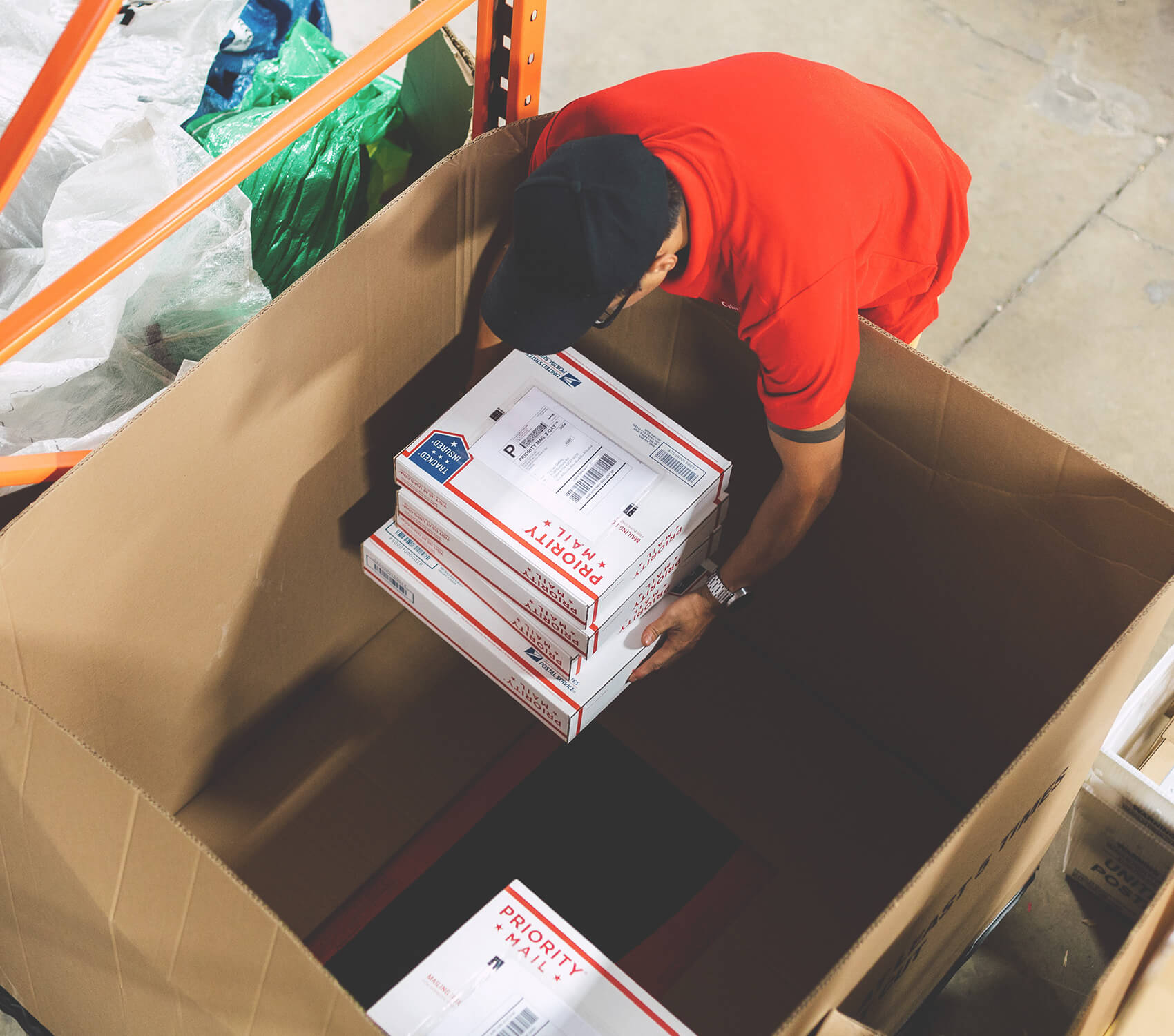
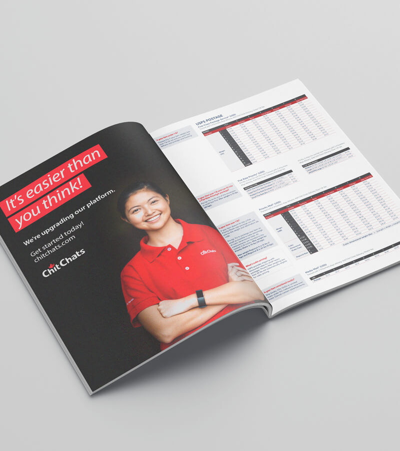

Story Telling
To help with the entry barrier of potential clients who might not understand the business enough to sign up, we developed storytelling tools. Using real staff members, I directed videos that created legitimacy, trust, and explained the business in a playful, easy to comprehend way. Client testimonials provided the social proof needed to convert those on the fence.